
TL;DR I led design and research for a full redesign of the TikTok Ads console help system — transforming a basic, context-blind link panel into a contextually aware experience that surfaces relevant content, videos, and support directly where advertisers need it. Research showed 60% of users couldn't find relevant help, mobile users had zero access, and 45% of support tickets were already answered in existing documentation — just undiscoverable. I designed through two rounds of exploration before landing on a version that went live first, then iterated with design system updates and GenAI assistant integration. The result: a 45% improvement in self-service rates, a 30% reduction in support tickets in the first two quarters, and a 40% higher campaign completion rate among users who engaged with help content — correlating to $40M in campaign revenue.
The problem
Users struggled to find relevant help content within the console, leading to increased support tickets and reduced self-service success rates. The existing help panel was limited to basic links and lacked contextual awareness of the user's current page or needs. 60% of users were unable to find relevant help, and mobile users had zero access to help panel functionality.
The goal
Redesign and enhance the console's help system to deliver contextually relevant support content. Five targets:
- Improve self-service success rate by 40%
- Reduce support ticket volume by 25%
- Increase help content discoverability
- Provide contextual assistant based on user location within console
- Create a consistent, mobile-friendly help experience
Our users
Three distinct user types with very different needs:
- New Advertiser Sarah (28) — Digital Marketing Manager. Needs quick onboarding and basic feature understanding. Overwhelmed by options, needs guided assistance. Goal: launch first campaign successfully.
- Experienced Advertiser Michael (35) — Advertising Director. Needs advanced feature documentation and troubleshooting. Time-sensitive issues, needs quick solutions. Goal: optimize campaigns efficiently.
- Agency Manager Lisa (42) — Agency Team Lead. Needs bulk management features and team coordination. Managing multiple accounts and training team members. Goal: streamline operations across accounts.
Research
How advertisers felt about our current support products:
- Advertisers felt lost when seeking help — They didn't know if they should go to support center or contact us.
- 60% of users were unable to find relevant help
- 45% of support tickets were addressed in help documentation — already self-servable, just not discoverable.
- Associates noted recurring questions — Support staff noted recurring basic questions that could be self-served.
- Mobile users had zero access to help panel functionality.
The proposed solution
A contextually aware help panel that allowed access to short form content and videos without requiring advertisers to navigate to a separate support center — which could negatively impact key metrics such as campaign completion rates.
Tech considerations
Key technical constraints that shaped the design:
- Integration with existing support center — bring in current support center content so advertisers don't have to navigate to a new page.
- Localization requirements — ensuring localization in every console language is available using machine translation.
- Mobile responsiveness — all pages and the panel itself must be mobile friendly; a modal when on mobile.
- Performance optimization — content load has to be near seamless.
- Content management system integration — ensuring our CMS can support the content structure needed.
Design exploration
Existing panel — The existing In-UI help panel was very basic and only accessible through the question mark in the top right of the screen. You could click links and be met with content that may or may not help you.
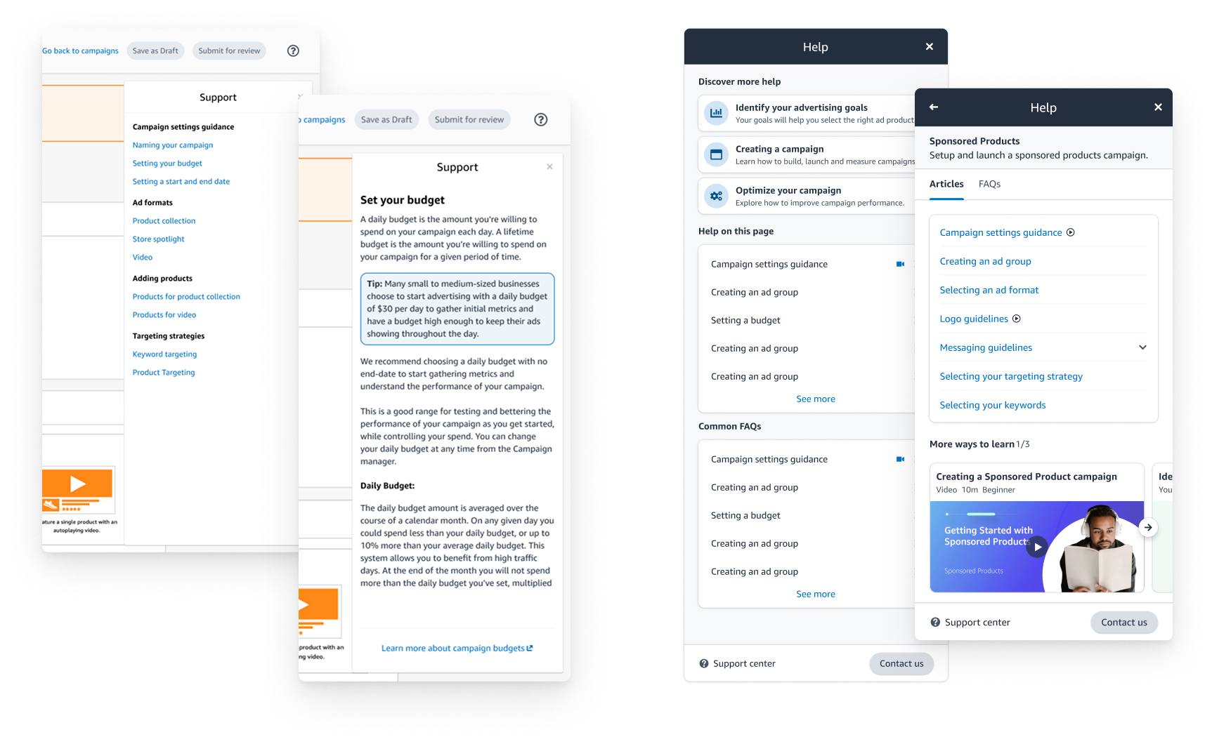
Exploration 1 — A more robust panel but still beholden to an abundance of links. How could we simplify? We also started to experiment with in-UI links to specific content that was relevant to the content in cards on the page.
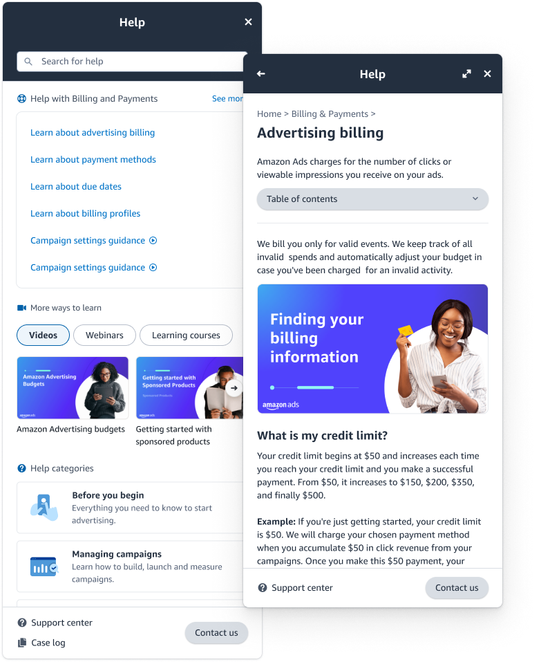
Exploration 2 — After testing our previous design with advertisers we focused on bringing in more content types. We introduced video content to the In-UI help landing and focused on contextual help at the top of the panel. We also added more content (all of support center) which needed a search. This is the version that went live first.
Final design
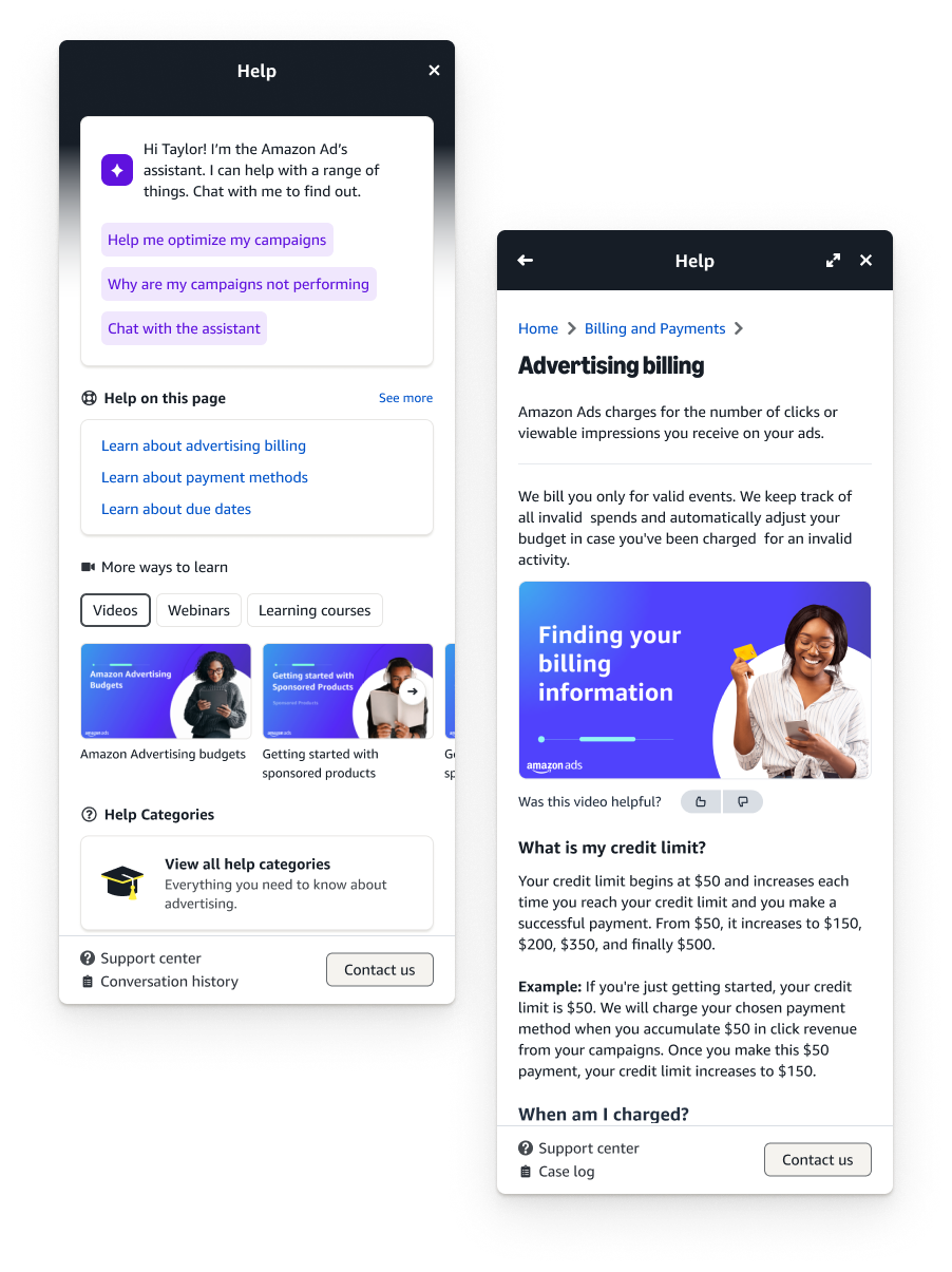
After being live for some time the help panel was recently updated to our newest design system. Small tweaks over time, mainly for simplicity and to accommodate our new GenAI assistant into workflows.
Design handoff
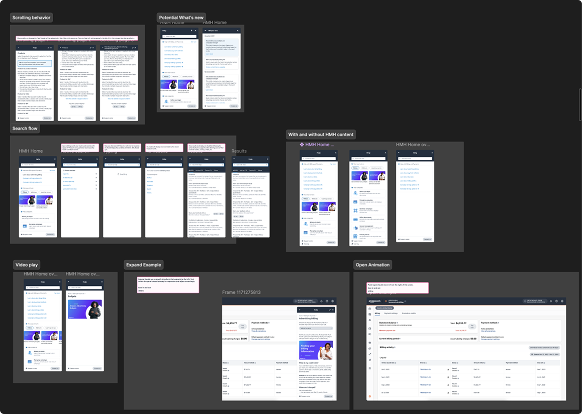
Handing off to our engineering team took quite a while. We had multiple syncs to ensure proper adherence — covering scrolling behavior, search flow, video play, expand examples, and open animation states.
Outcomes
We met our goal from both a user and business perspective. We were able to affect change on a large scale with just help content improvements.
- Improved self-service rates by 45% — tracked access to self-service from only support center to now in-UI help.
- Reduced tickets by 30% — reduced support tickets by almost 30% in the first two quarters of release.
- Measurable impact on campaign creation — once someone used our help content we saw a 40% higher chance of completing a campaign, correlating to $40M in campaign revenue.
- Mobile friendly — with more pages becoming mobile friendly across console we set ourselves up for success into the future.
What's next
- AI integration — implementation of AI-powered content recommendations and predictive help based on user behavior.
- Performance optimization — continuously monitor load times and cache optimization for frequently accessed content.
- Feature evolution — continuously collect user feedback, quarterly feature assessments and updates, and integrate with new platform features as they launch.
Reflections
Although this was a fast moving project, I wouldn't have changed anything. We moved fast and iterated intentionally.